Santiago Catano
I’m Santiago Catano, a graphic designer focused on creating thoughtful, engaging visuals across print and digital media. This site showcases my design work, creative process, and visual style. Whether you’re here to explore or collaborate, I’m glad you stopped by.
Gallery

Logo Concept

The Gap Bag

Album Cover ART

Festival Poster

Typeface Specimen Poster

Infographic Design

Brand Concept & Product Label Design

Illustration for Editorial Use
Logo

50's Icon Set

Playing Cards Design
Salon Merchandise Mockup
Santiago
Catano
works
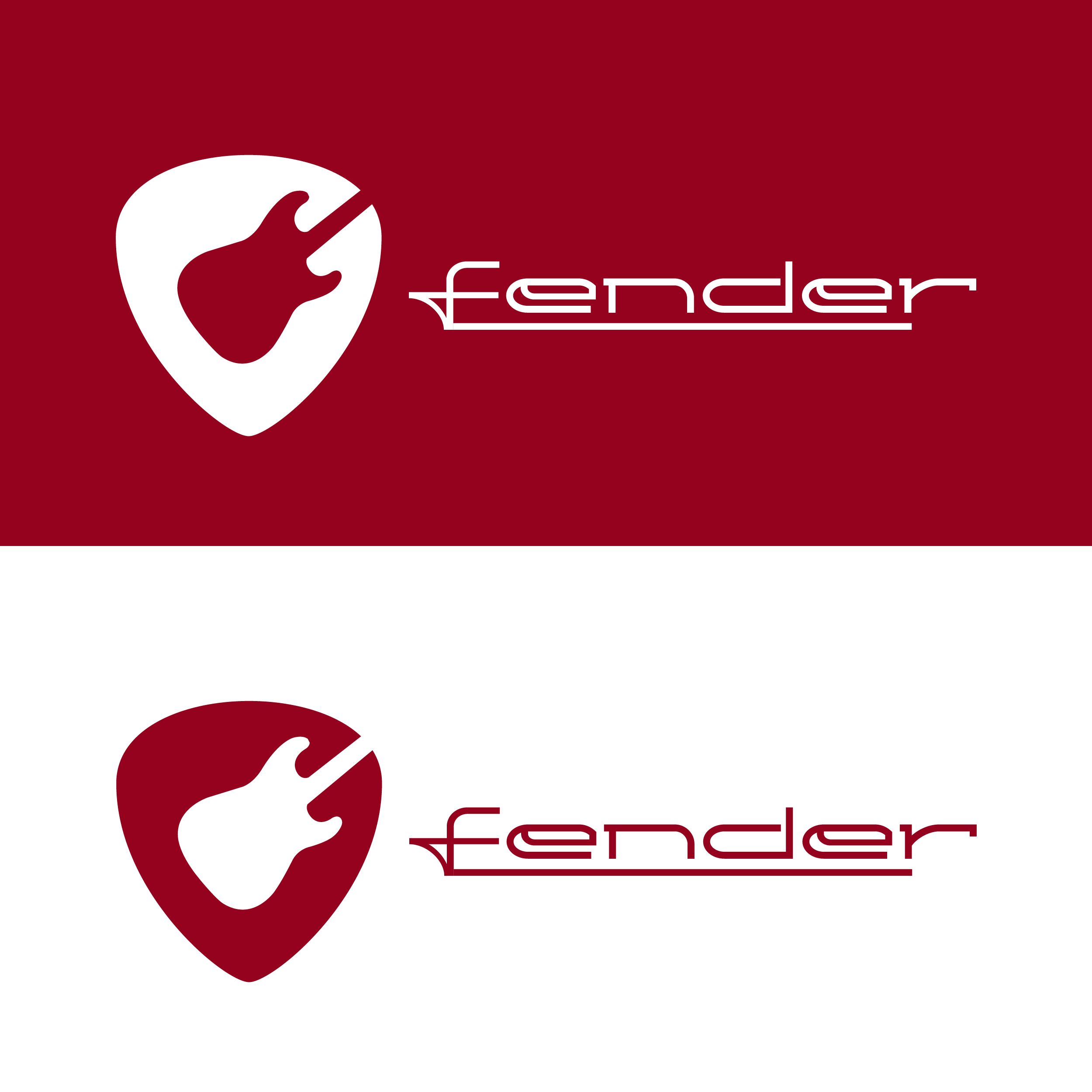
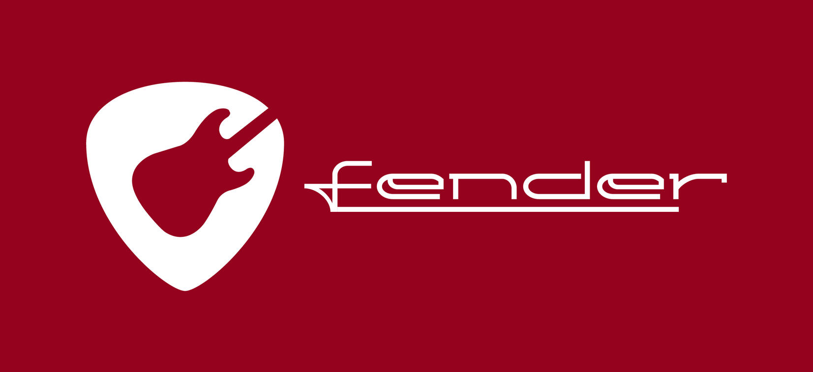
Logo Concept for Fender
This modernized logo reimagines Fender for a younger, style-conscious audience. The classic guitar silhouette is placed inside a bold, simplified pick shape for instant recognition, while the custom typeface adds a sleek, contemporary edge. The clean lines and deep red palette balance retro roots with a fresh, digital-era vibe—giving the brand a bold new voice without losing its rock heritage.
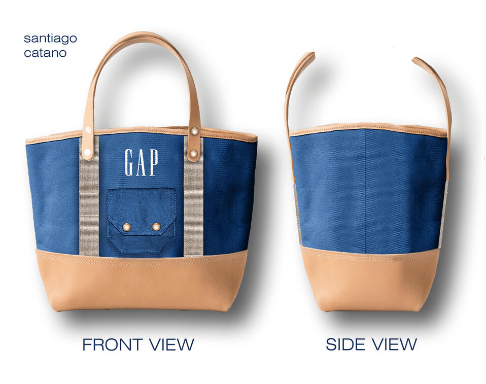
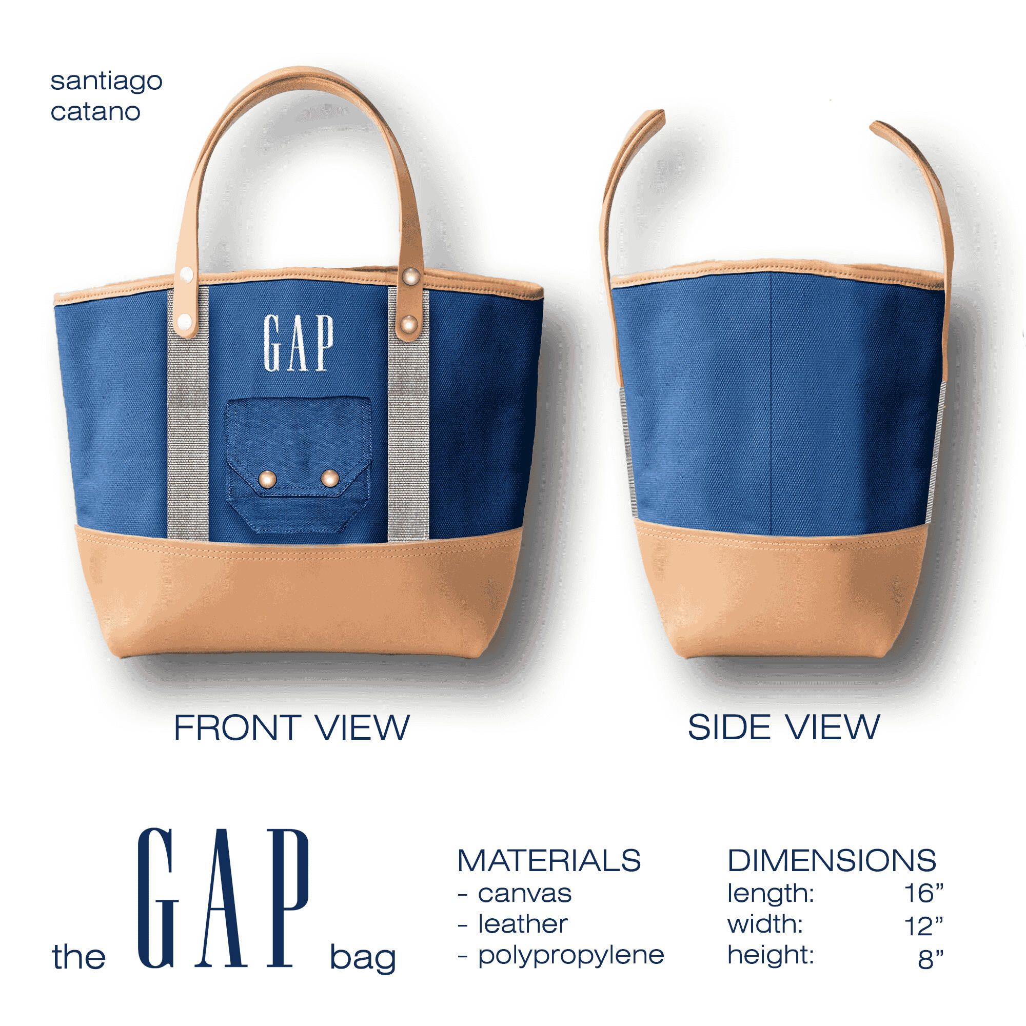
gap bag
concept & design
This tote bag design focuses on clean structure, refined materials, and subtle branding to create a polished, high-end look. The deep navy canvas contrasts with neutral polypropylene straps and natural leather details, giving the bag a modern yet durable feel. A front flap pocket adds functional elegance without disrupting the minimalist silhouette.Every element, from stitching to spacing, was carefully considered to create a cohesive and elevated branded item. The result is a stylish, functional tote that feels both premium and practical.
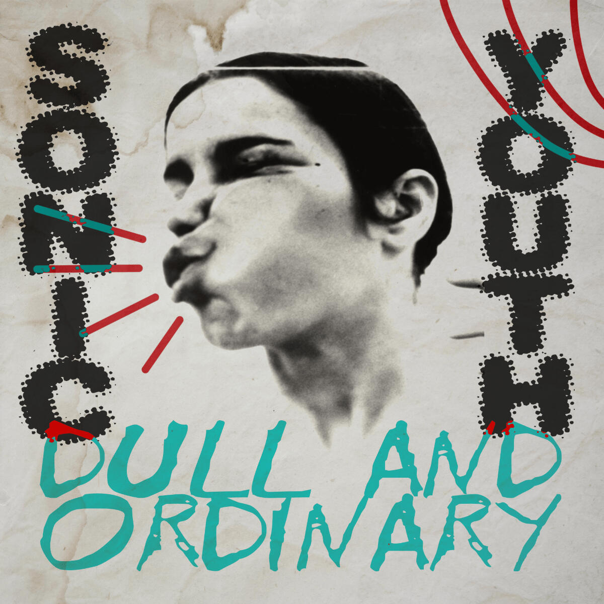
Album Cover Design
This album cover was designed as a conceptual release for Sonic Youth, capturing the band’s experimental sound and raw aesthetic through bold composition and visual tension. A distorted grayscale portrait forms the focal point, contrasted by hand-drawn typography and rough, poster-like textures that mirror the band’s noise-driven energy.The limited color palette, focused on red and cyan accents, adds intensity and mood while enhancing contrast. The vertical arrangement of the artist’s name breaks convention, adding visual edge and structure. Together, these choices create a striking cover that feels gritty, expressive, and true to the band's underground identity.
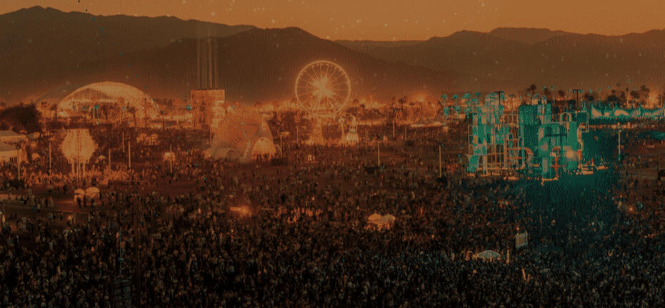
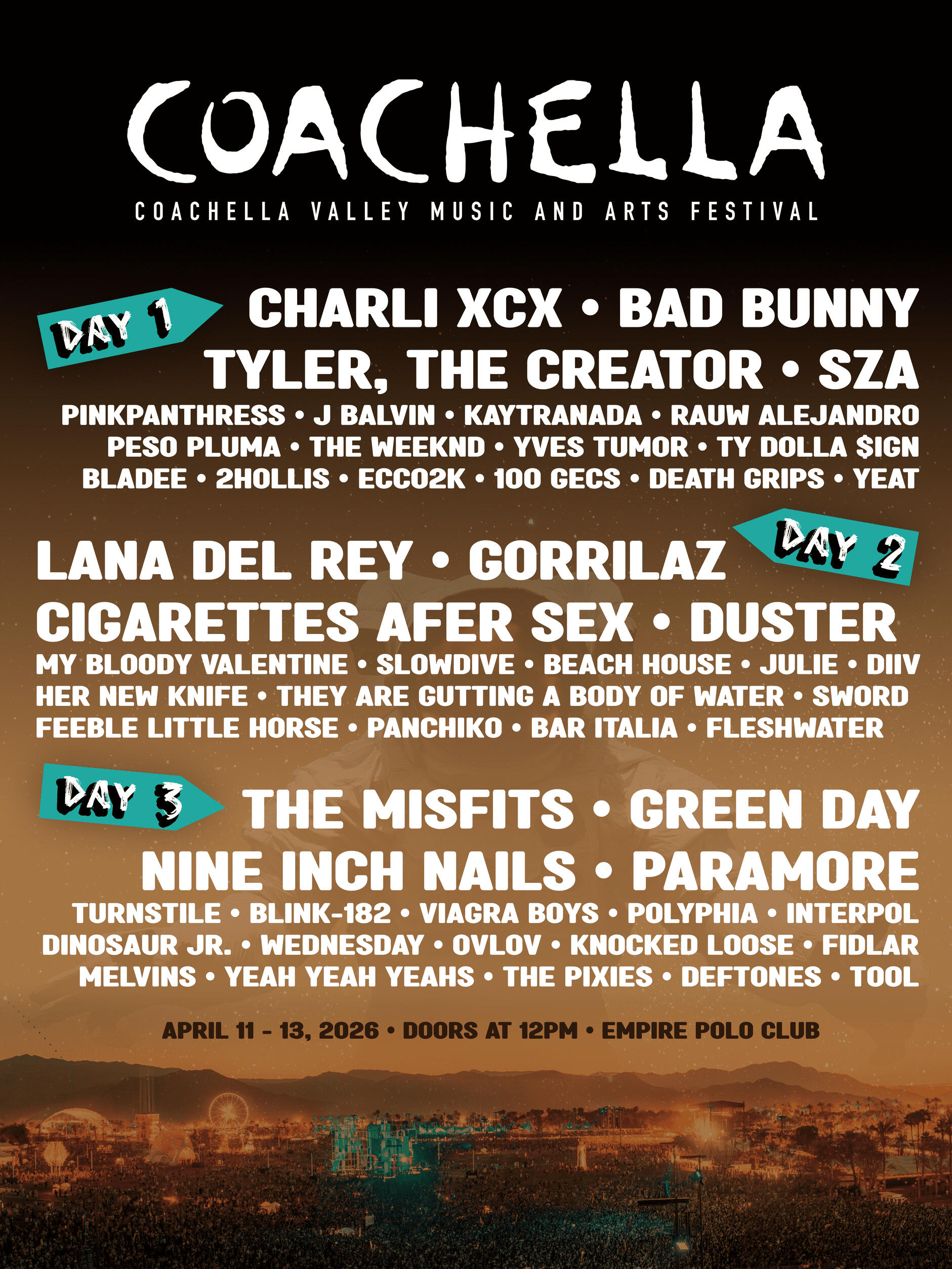
Festival Poster Concept & Design
This poster was designed for a conceptual 2026 edition of Coachella, one of the most iconic music and arts festivals in the world. The goal was to capture the event’s immersive and expansive atmosphere through a bold, modern layout and a vibrant, sunset-inspired color palette. A backdrop of gradient tones reflects the desert sky at golden hour, setting the stage for the lineup while evoking the warmth and energy of the festival experience.The artist lineup is arranged with clear typographic hierarchy to highlight headliners while maintaining balance across secondary acts. The layout uses stylized day markers, thoughtful spacing, and subtle graphic accents to guide the viewer’s eye and organize the information without overwhelming it. Visual elements like the desert silhouette and layered text contribute to the sense of scale and location, grounding the design in Coachella’s unique identity.
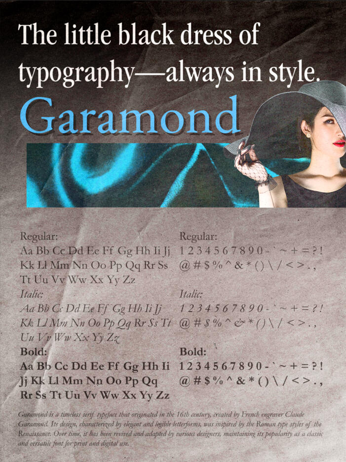
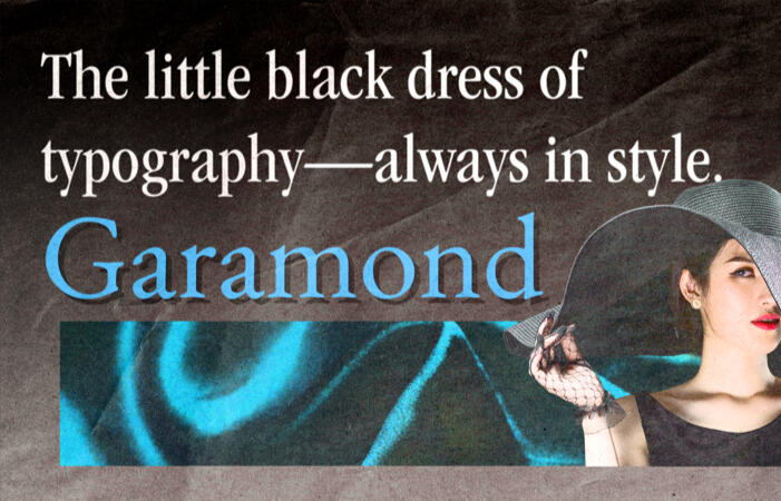
Typeface Specimen Poster
This project explores the timeless elegance of Garamond through a typographic showcase designed for an 18" x 24" poster format. The goal was to visually communicate Garamond’s classic appeal while maintaining strong typographic hierarchy and clarity.The poster presents the typeface in three distinct styles—regular, italic, and bold—along with a full character set including numerals, punctuation, and symbols. To enhance the aesthetic and reinforce the concept of Garamond as “the little black dress of typography,” I paired the refined letterforms with a high-fashion editorial visual theme. The background features rich textures, subtle gradients, and a silk-like fabric to evoke luxury and timeless sophistication.
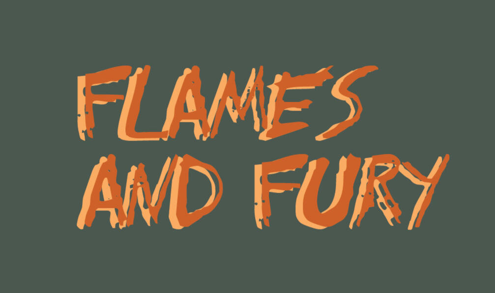
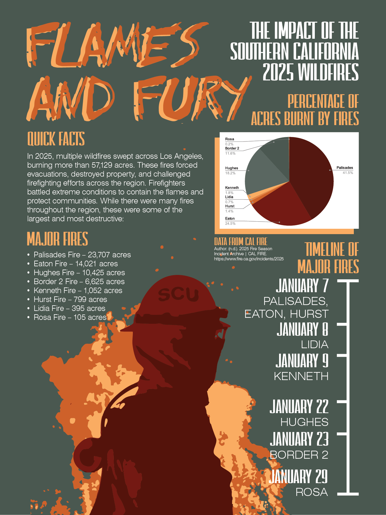
Infographic Design
This infographic visualizes the devastating impact of the 2025 Southern California wildfires through a dynamic, data-driven layout. The objective was to present complex information in a clear, engaging, and emotionally resonant format.
The design features a bold title and strong typographic contrast to immediately draw attention, paired with a muted green-orange palette that evokes both urgency and the natural landscape. Key information is broken into distinct sections—Quick Facts, Major Fires, and a Timeline of Events—to guide the viewer’s eye and maintain clarity.Illustrative elements, including a silhouetted firefighter and stylized flames, add emotional depth and help contextualize the human side of the data. Careful use of hierarchy, spacing, and color ensures the layout remains legible and well-organized, even with multiple data types present.The infographic is sourced directly from CAL FIRE incident reports, providing reliable data and grounding the visual storytelling in real-world context.
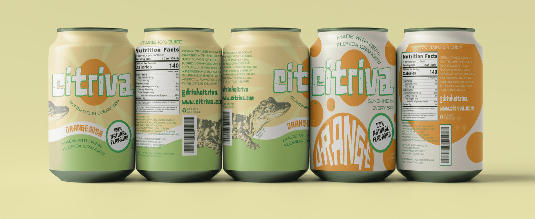
Product Label Design
The Citriva Orange Soda label series explores three unique design directions while maintaining a cohesive brand identity. Aimed at a youthful audience, each label features the custom Citriva logotype, the alligator mascot “Sunny,” and the tagline “Sunshine in Every Sip.” Bold typography, vibrant colors, and playful illustrations help communicate the product’s fresh, citrus-forward personality.Each label takes a different visual approach: one inspired by retro sunshine graphics, another by natural, organic textures, and a third by pop-art patterns. Designed in Adobe Illustrator, the layouts balance creativity with clear hierarchy for both branding and product info, showcasing versatility in packaging design.
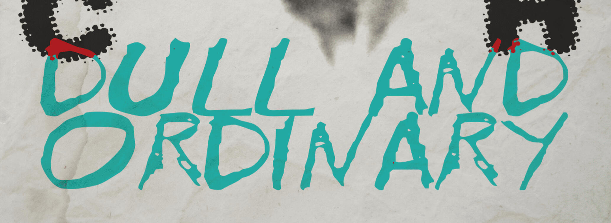
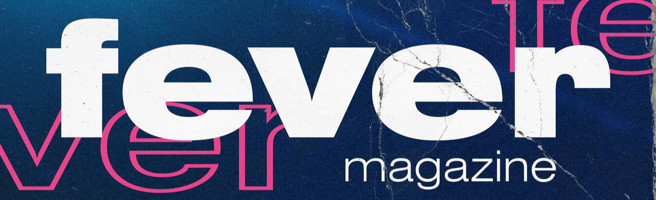
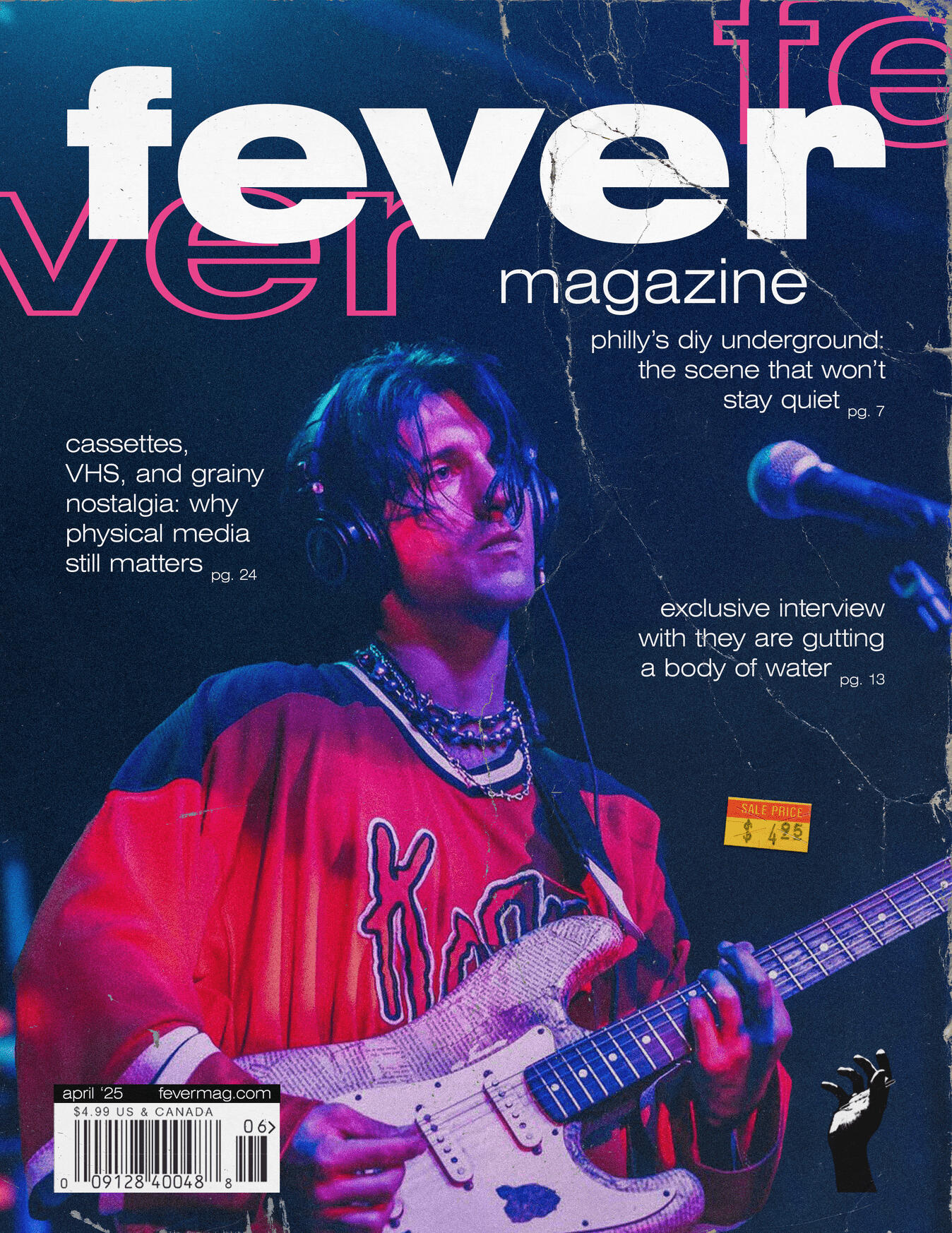
Illustration for Editorial Use
Fever Magazine is a conceptual music publication focused on underground and independent artists. The cover design captures the raw energy of alternative music culture through bold typography, gritty textures, and a dramatic, high-contrast image. A strong visual hierarchy guides the viewer’s attention while reinforcing the magazine’s edgy and expressive tone.Layered headlines, distressed details, and stylized graphic elements enhance the authenticity of the piece, creating a sense of urgency and movement. The overall composition reflects the intensity of the music scene and speaks directly to a niche audience that values creativity, individuality, and artistic risk.The design also considers real-world application, featuring balanced spacing, clear cover lines, and a dynamic title placement that makes it both eye-catching and readable on a shelf. It demonstrates an understanding of editorial design principles while allowing space for creative expression within a genre-driven visual system.
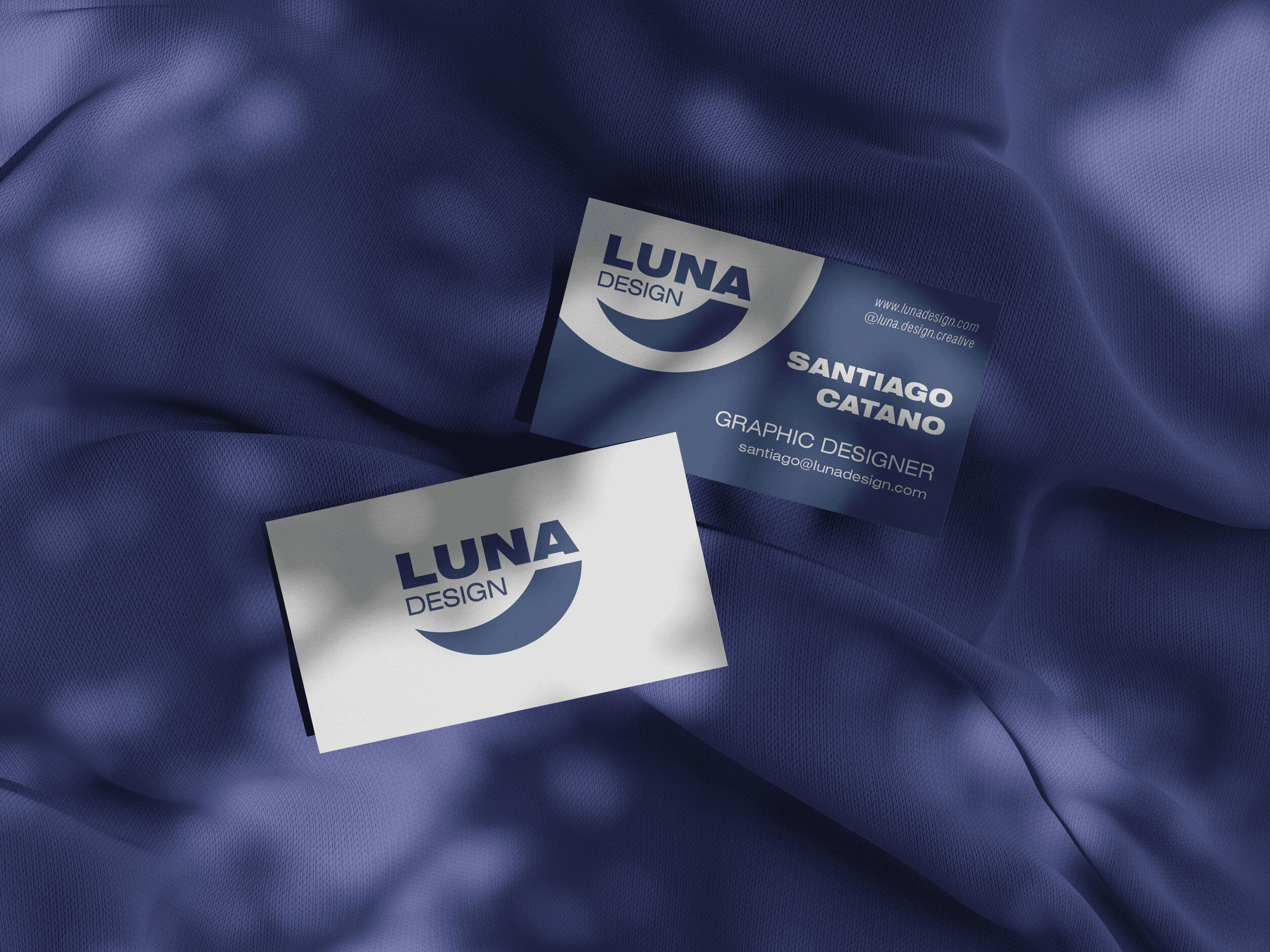
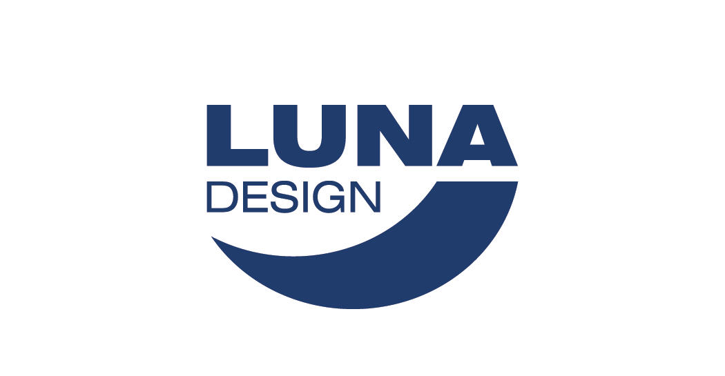
Personal Branding Project
This branding project for Luna Design showcases my identity as a graphic designer through a cohesive visual system. It includes a custom logo and a professionally designed business card that reflects my clean, modern aesthetic. The logo features bold, geometric typography balanced with a crescent shape, symbolizing the moon and representing creativity and clarity. The business card integrates this visual style with a strong typographic hierarchy and a minimalist layout, communicating professionalism and approachability. A mockup presentation is also included to demonstrate how the design translates in a real-world context.
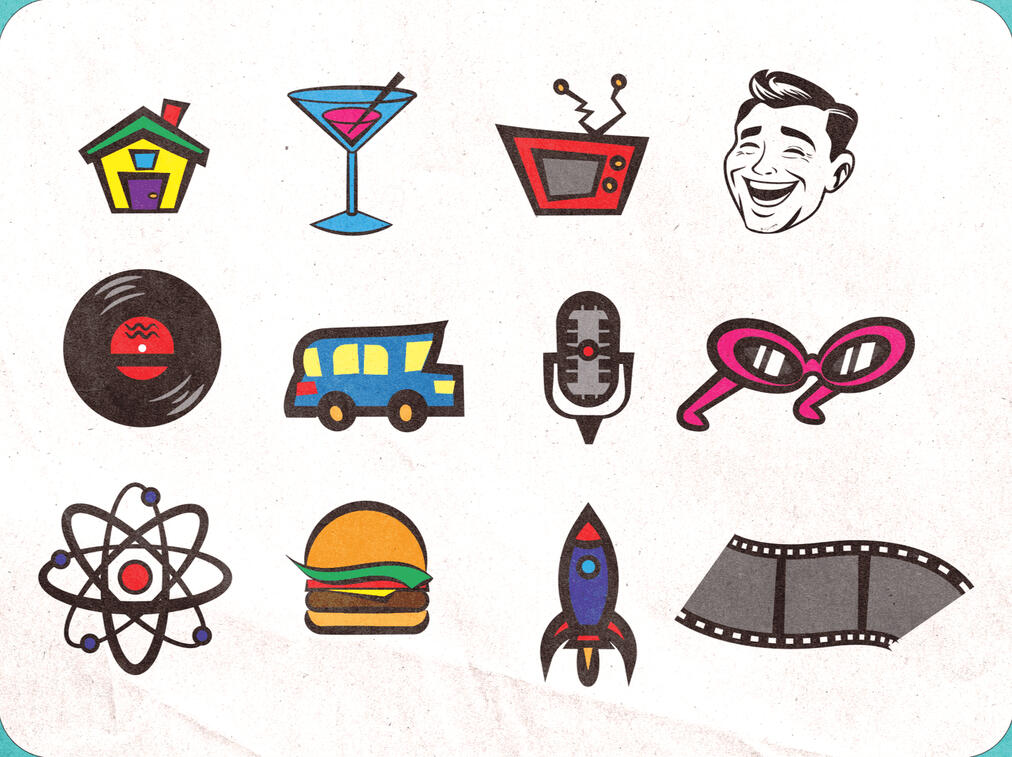
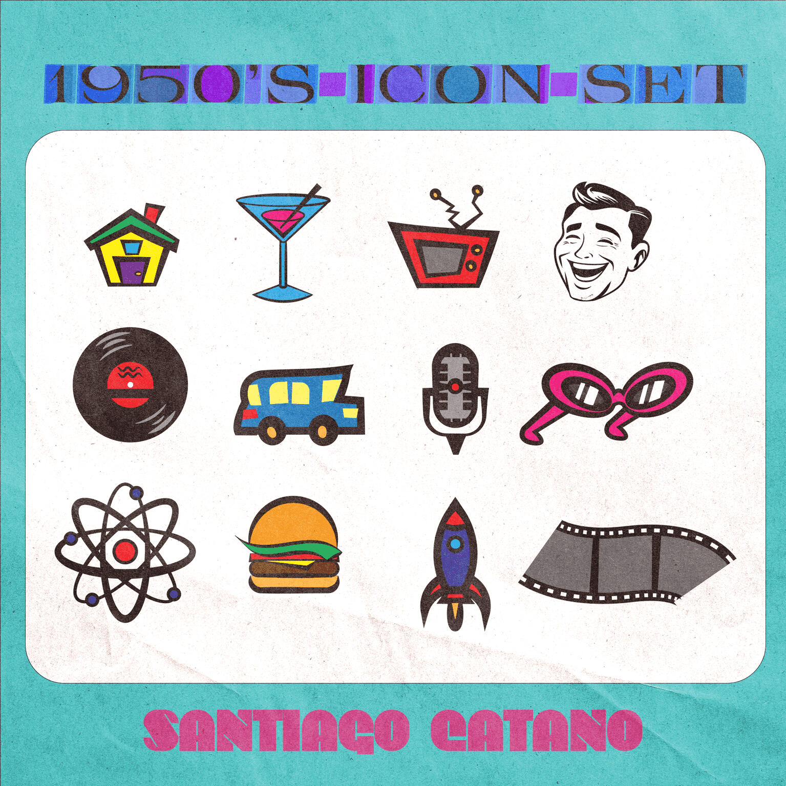
1950's Icon Set
This icon collection was created in Adobe Illustrator and is inspired by the bold, playful aesthetic of 1950s pop culture. Each of the 12 icons captures a recognizable symbol from the era, including elements like a retro TV, record player, rocket ship, and atomic symbol. The set was designed with a cohesive visual language—featuring thick outlines, vintage textures, and a bright, limited color palette—to ensure clarity and unity. These icons are fully vector-based, making them scalable for both print and digital use. The layout highlights their versatility while evoking the nostalgic charm of mid-century design.
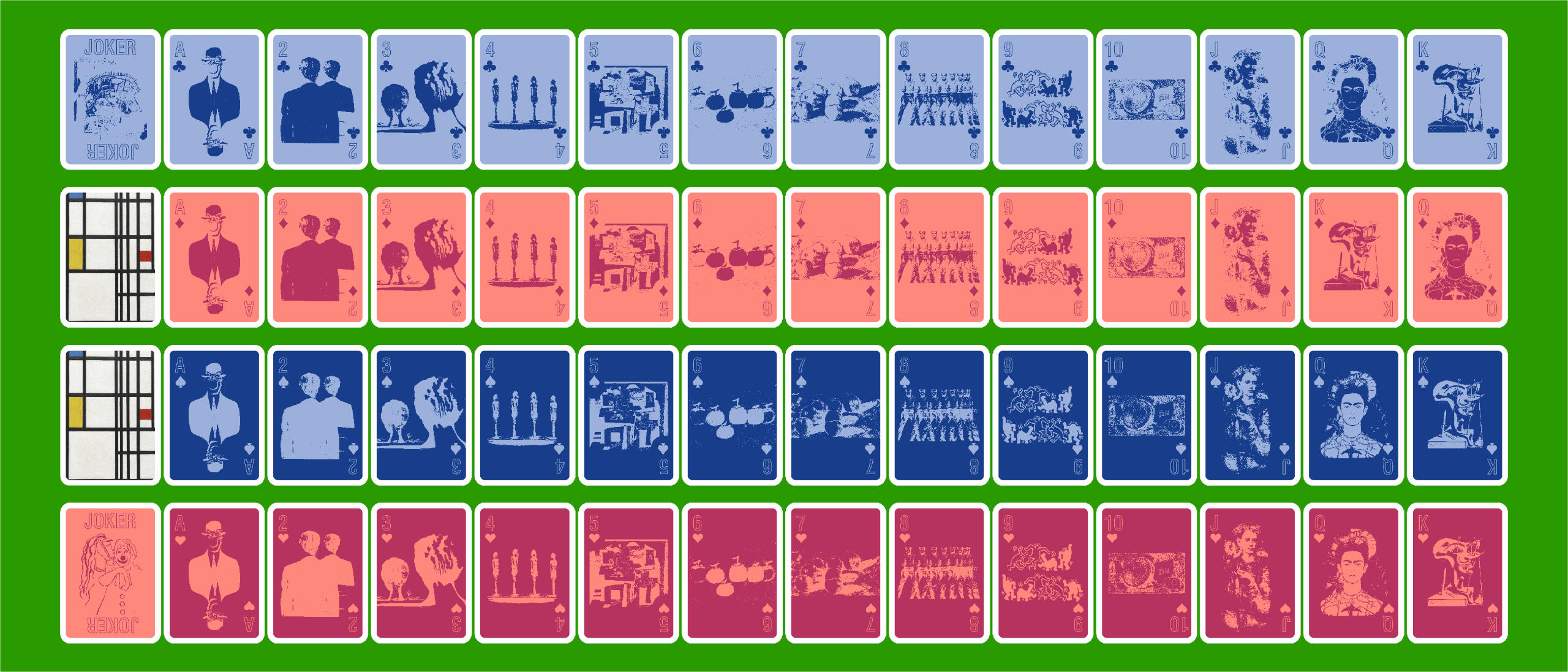
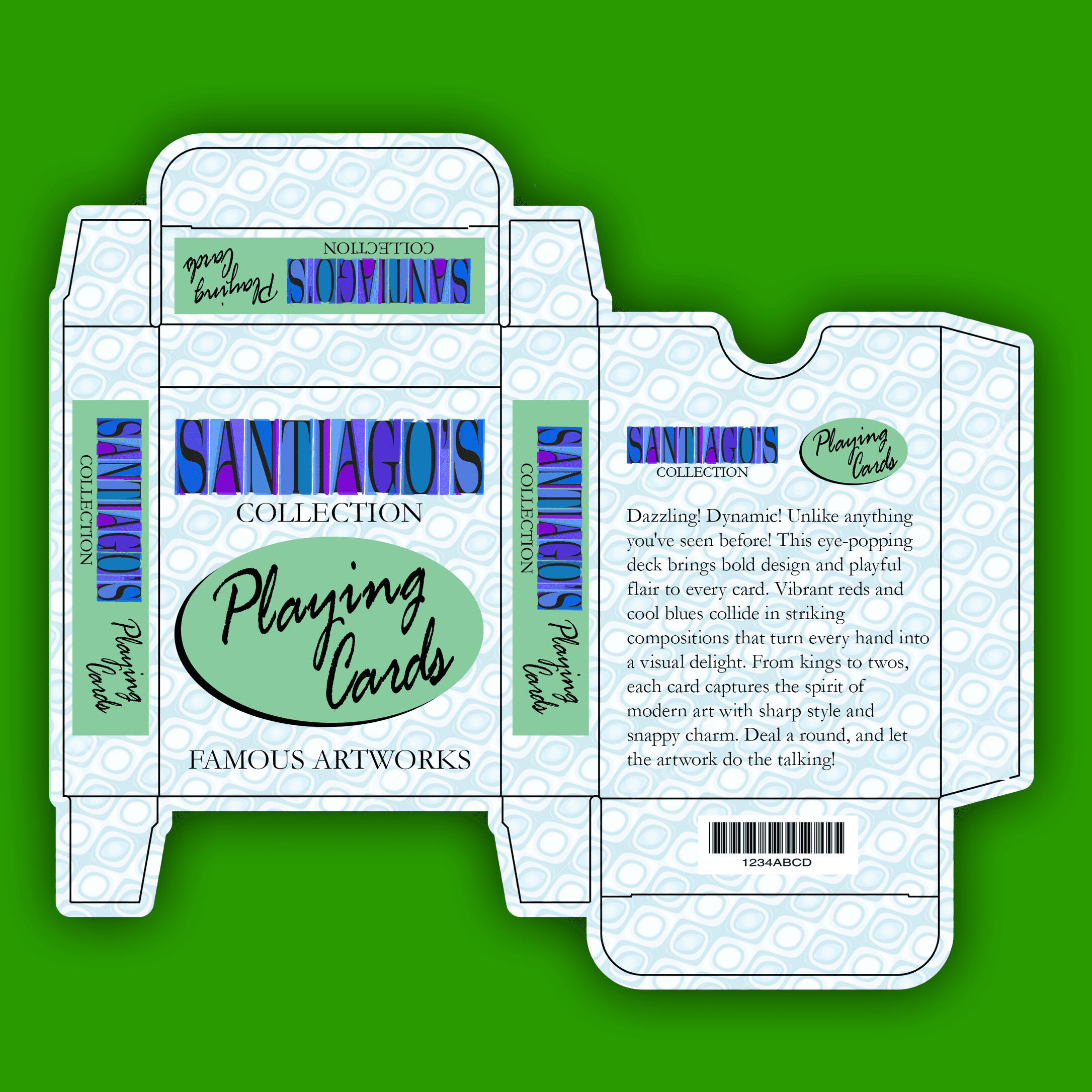
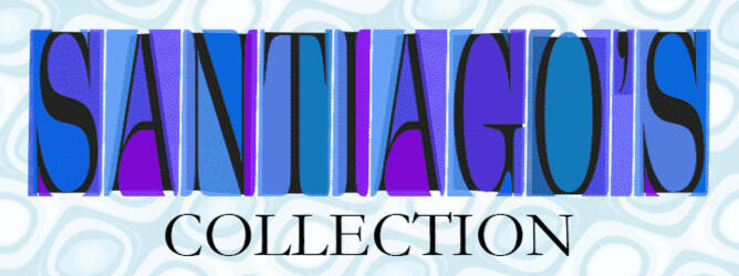
Playing Cards design
This Santiago’s Collection project features a fully illustrated 54-card deck inspired by famous artworks and filtered through a bold, modern pop art lens. Each card transforms a well-known piece of art into a surreal, two-tone visual, using vibrant red and blue gradient overlays to build a cohesive, eye-catching style across the entire set. The numbered cards cleverly align with the subject matter—matching card values to visual elements in the artwork—creating a subtle but playful storytelling device throughout the deck.The design maintains traditional card structure while embracing modern experimentation with symmetry and color blocking. Royal face cards feature iconic figures like Frida Kahlo and René Magritte, rendered in simplified posterized forms for a punchy, expressive look. The jokers and custom back design further the deck’s identity, while the packaging echoes mid-century commercial style with energetic typography and vintage tones. Together, the set captures the essence of fine art with the charm of collectible design.
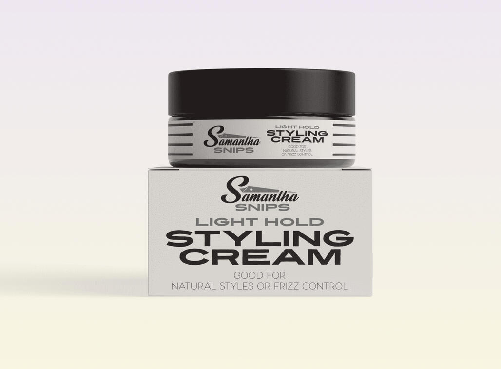
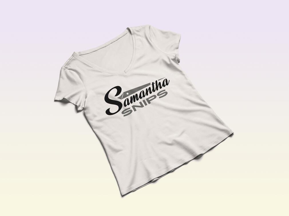
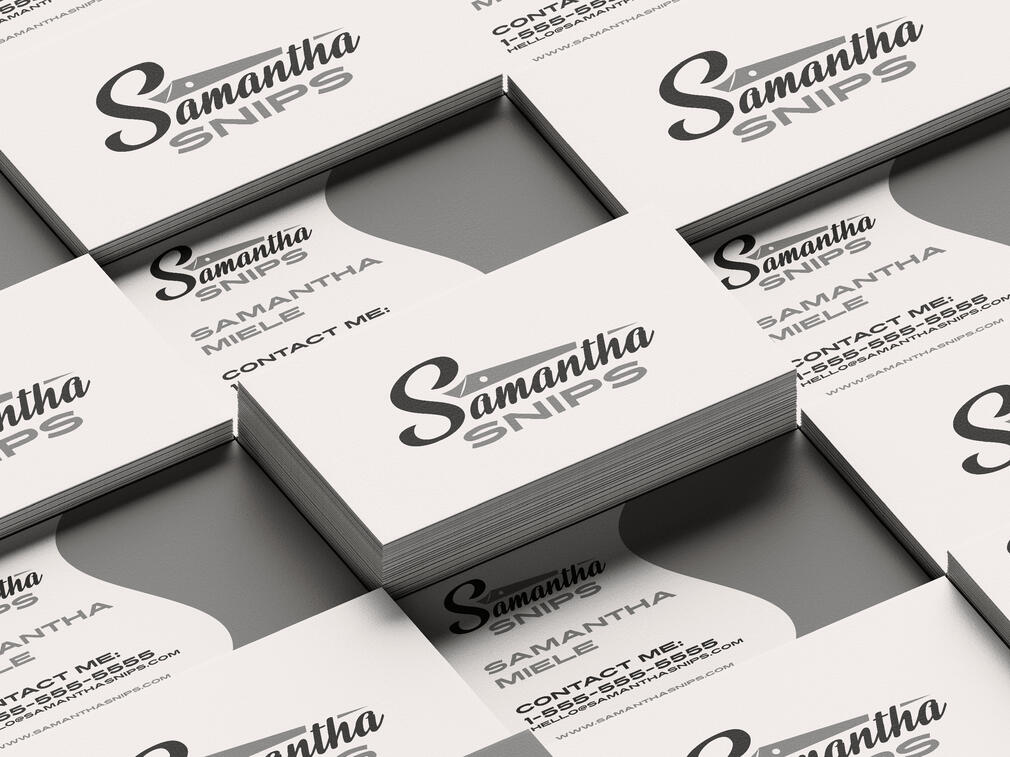
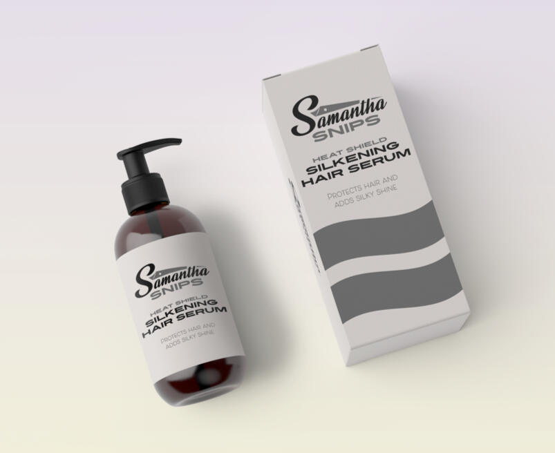
Brand Merchandise Mockup
This collection features five branded items designed for Samantha Snips. It includes a t-shirt, business cards, and custom product packaging for styling cream, leave-in cream, and hair serum. Consistent typography, clean design, and salon-inspired elements unify the set, showcasing a sleek and professional brand identity.

Styling Cream
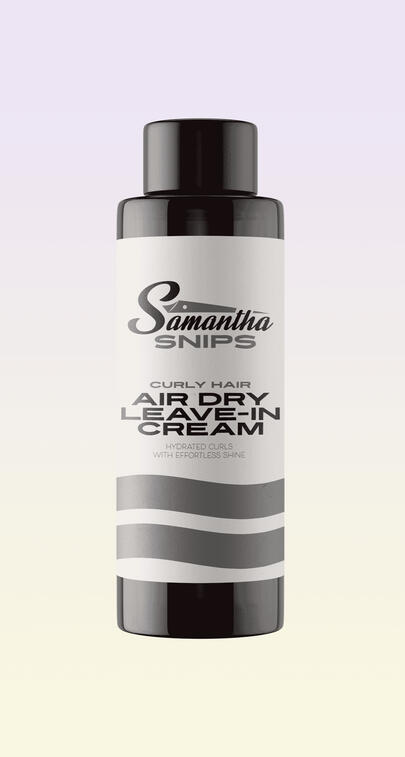
Leave-In Cream

T-Shirt

Business Cards
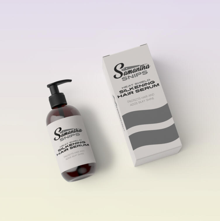
Hair Serum